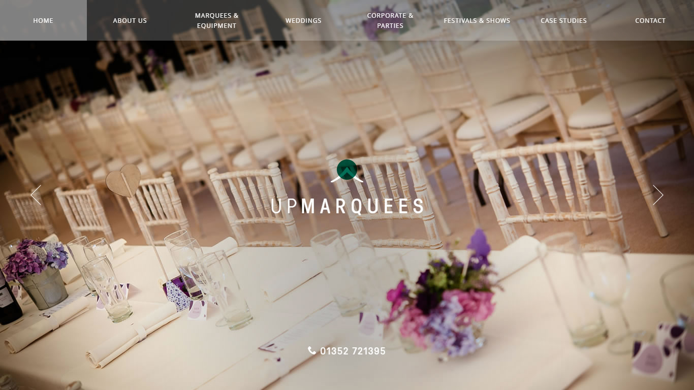
— The website design as viewed on desktop, mobile and tablet devices.
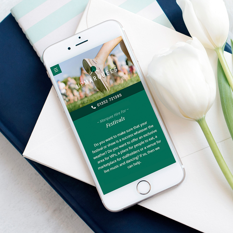
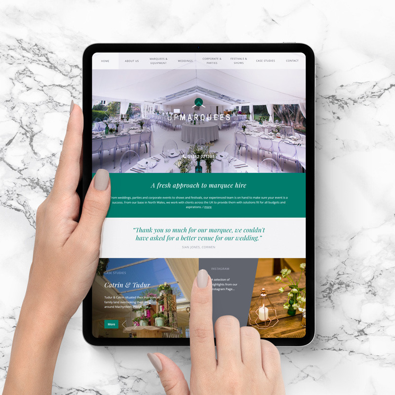
Chris Walker, of UpMarquees Ltd, first touched base with me 10 years ago. He was looking for a brand refresh and new website for his North Wales based marquee hire business.
He had contacted a number of local web design agencies, but made a point of saying he was impressed with my grip of his brief. I find it’s always important to understand all the ins and outs of a project, so I know exactly what is needed, and the client knows exactly what they are getting.
Over the years the website has undergone various upgrades and tune-ups to ensure it performs well, and then in a few years on I was commissioned once more for a rebrand and website redevelopment to bring everything in line with how UpMarquees as a company had evolved, and also to ensure the website was up to date with web technologies.
The wedding industry had changed rapidly during the rise of social media, and so the brand and website needed to reflect these changes. It was certainly heart-warming to know that Chris still saw me as the web designer and developer to take things to the next level, and to still have that grasp of his industry and what was needed.
Logo.
The logo re-design and development I would describe as an evolution rather than a complete overhaul. We felt it was important the logo remained recognisable, but still acknowledge it needed to look a little slicker, established and confident. Twee and pretty was out, hip and self-assured was in – with a splash of elegance.
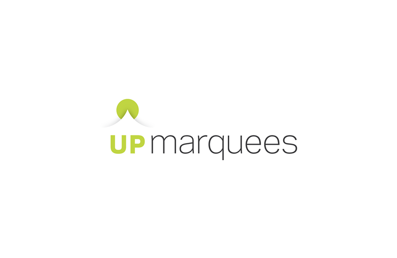
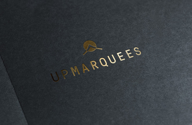
— My original logo, which I then recently re-imagined.
Website.
In terms of the website, we continued our emphasis on the importance of quality photos and videos to do the “sell”. Yes, visitors need to see your products and be reassured of their quality, and the quality of the service, but ultimately in the wedding industry you are selling a lifestyle and inspiration: “We need to use UpMarquees because look at what a wonderful time everyone is having at that wedding!”
Because there are a variety of styles a wedding could be, it was important the website style itself was kept minimal, so as not to conflict with these different styles – but also be unique. A tricky balance but one we both feel was achieved.
CMS.
Under the bonnet the site is powered by Craft CMS – allowing the client full control over content, photos and videos. The advanced Case Studies module allows for fresh content to be added to the site regularly, but – unlike a generic news or blog module – the content is focussed, interesting and useful to visitors. Photos, floorplans and specifications provide ideas and inspiration to prospective customers.
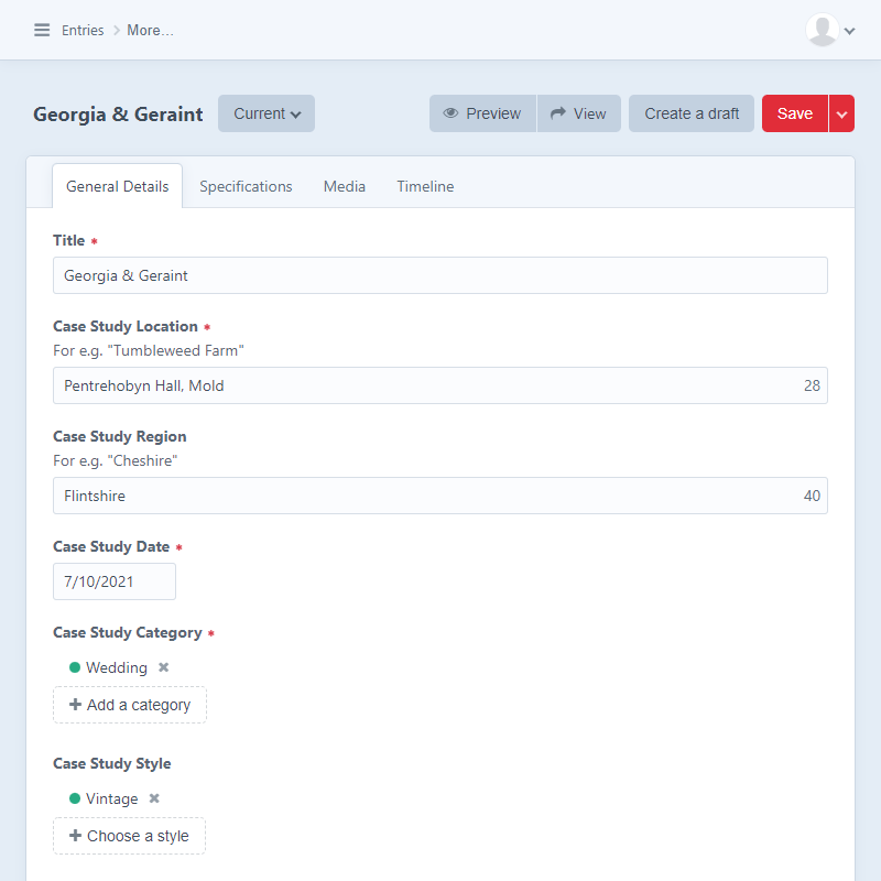
— Powered by Craft CMS; Bespoke case study module.
SEO.
UpMarquees has always performed well on search engines, but when UpMarquees acquired a local rival company called northwalesmarquees.co.uk – which also performed well on search engines – it became a great opportunity to improve the website’s SEO – if done correctly.
My years in the industry has given me a strong understanding of SEO methods and best practice. With a strategy of research, planning and statistical analysis, a plan of action was formulated. This involved a staged approach of:
- Changing content on key pages of northwalesmarquees to inform and link users to UpMarquees
- Strategically placed 301 redirects on pages to pass users and “juice” directly to the relevant content on UpMarquees
- A period of analysis to establish when all “juice” had passed over, so the acquired site could be slowly removed, without negative impact

— Magic!

— UpMarquees sitting at the top of Google.
The process worked like a dream, with UpMarquees moving from a healthy first page listing, right up to the top spot for many of their core keyword searches.
If I hadn’t have treated this process with care and attention, a big opportunity would have been lost.
The website remains is a healthy position, with health checks and audits performed by me regularly to ensure all is well on all fronts.
Moving forward.
With each season, new videos and photos are added which freshens things up. An advantage of the design, is that – with the right photos and videos – the entire website can look “re-born” with regularity. This also gives the website a healthy shelf-life and added value for money.


— Quality photography.
From our recommendation, the team are active in all the right ways on social media to help push and support visits to the website.
It has – and continues to be – a great project to be involved with. I look forward to my continued role in its success.
- Logo design and branding
- Web design and development
- Search engine optimisation
- CMS set-up and configuration
- Marketing consultancy
“Freelance-Web.Design provided us with the design work, graphics and online marketing tools to help stay ahead of the competition, which has hugely contributed to the growth of our business in a comparatively short space of time. Always ahead of the curve when it comes to digital marketing and the trends that change so frequently, and also very forthcoming with ways in which to improve our online presence. Highly recommended.”
Interested in what I can do for you? Contact