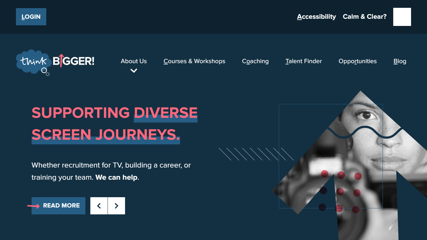
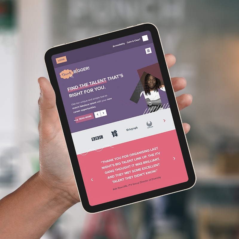
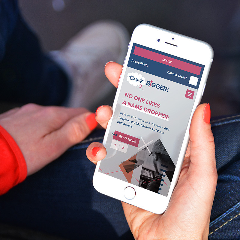
— The new website design on various devices, showing a different introduction slide in each case.
thinkBIGGER! — a training company for television — have been a client of mine since 2009. Edi Smockum first contacted me in November of that year saying she needed a designer for her new start–up company. Fast–forward 13 years and our working relationship is still going strong. Edi is fantastic to work with.
I was commissioned to design the original logo and brand, and also design and build a bespoke website that included a courses management tool. I joined forces with my longstanding PHP programming buddy at BehindDesign, and together we developed a bespoke web application that worked perfectly for their requirements.
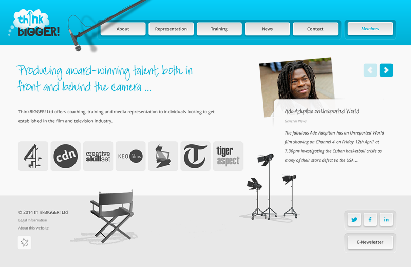
— The original logo design from 2011; The second generation website design.
Over the years, the website was updated to accommodate changes in web technology — e.g. the rise of mobile and tablet device use — and also to adapt to changes in the company’s service offering — with coaching, recruitment, representation and more, now big parts of a growing business. There have also been numerous side projects — print work, presentation slides, bespoke graphics — that thinkBIGGER! have used me for.
A sister company called thinkBIGGER! Presenting was also set-up during this time, which had a logo variation and it’s own brochure website, both of which I designed and developed. This was later absorbed back in to the parent company.
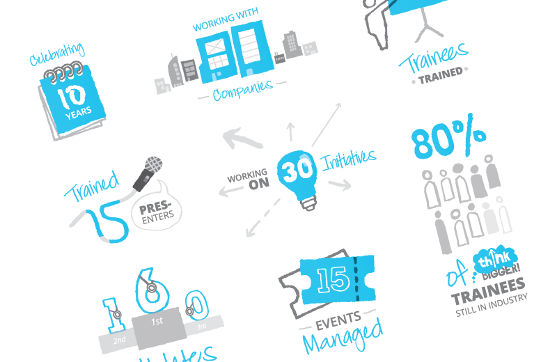
— thinkBIGGER! Presenting logo; Infographic I designed to celebrate 10 years of service.
Next level.
What I always find encouraging is when a client has the trust and confidence to recommission my services with a rebrand and/or a website overhaul. It would be easy, and also understandable, if a client wanted to go elsewhere for a fresh approach, but when they still see me as being the web designer and developer with the “right stuff” to take things to the next level — well, that just makes my year!
Client retention is something I place at the very top of my list of ambitions when working with clients, and I’m lucky that thinkBIGGER! aren’t an exception to the rule — the majority of my clients have been with me for a number of years.
In with the new.
The original logo had served us well, but it was beginning to look a little bit “of its time” — web2.0, and all that. Now I’m not one for following trends wholesale, or change for the sake of change, but I do feel it is important to at least nod towards current trends — if only to communicate to the viewer that a company has its finger on the pulse. The sweet spot is to look current and trendy, but still unique and innovative.
The brief for the rebrand we came up with together, and kept quite simple — sharper, fresher, more confident, more colourful. thinkBIGGER! was all grown up!

— The new logo design and a selection of the brand colours.
I particularly enjoyed developing the graphics for the website introduction slides. This graphical montage approach would also become something used on other material, to help build brand continuity and recognition across media.
- The photos contained within the upward arrow is both a nod to the logo, and also to communicate a positive message of progress, learning and improvement.
- The patterns of various size, colour and position are to communicate a feeling of diversity, dynamism and choice.
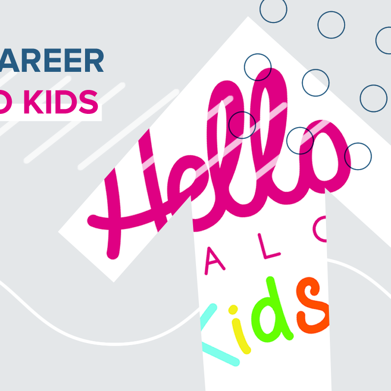
— Detail from a social media advert I created; Some of the pattern elements created for use when creating graphical assets.
Web development.
As well as the brand being applied to the website design, the structure and function of the site also needed to change to accommodate the new services the company now provides. The website now has systems for:
- booking and paying for courses
- members to access course content, schedules and support material
- companies to request talent for upcoming roles in the television industry
- booking and paying for 1 to 1 coaching
- trainees to apply for opportunities and schemes
The site is powered by Craft CMS, which caters for the above functionality, as well as enabling general content updates across the website, including a blog section.
I once again teamed up with BehindDesign to develop a bespoke quiz plugin that can be utilised on to digital courses — allowing users to answer questions and be scored on those answers. A useful learning aid.
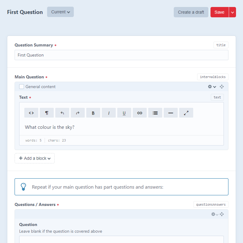
— Our bespoke quiz building CMS module; Powered by Craft CMS.
Accessibility.
I always design and code websites with accessibility in mind. The thinkBIGGER! website goes that extra mile with a “Calm & Clear” toggle function. This increases the contrast and removes visual clutter from each page, to aid users with visual impairments, and for users who can become distressed by too much visual stimulus.
Onwards and upwards.
I continue to work with thinkBIGGER! going forwards — be it helping with content design for their opportunities, courses and blog posts, or with logo design and graphics for their growing portfolio of schemes.
It’s a project I am very proud to be involved with.
- Logo / Brand design and development
- Web design and development
- CMS set-up and configuration
- Bespoke graphics for web and print
- Social media static and animated advert design
- Advanced accessibility
- On-going content design and editing
- Bespoke PHP programming
“Fantastically collaborative and really understand a brief. He has designed several logos for us, our lovely web site and each time I feel he always has our needs at the forefront of his work. He is brilliant to work with, and has a wonderfully creative mind coupled with great organisation to get the work done.”
Interested in what I can do for you? Contact