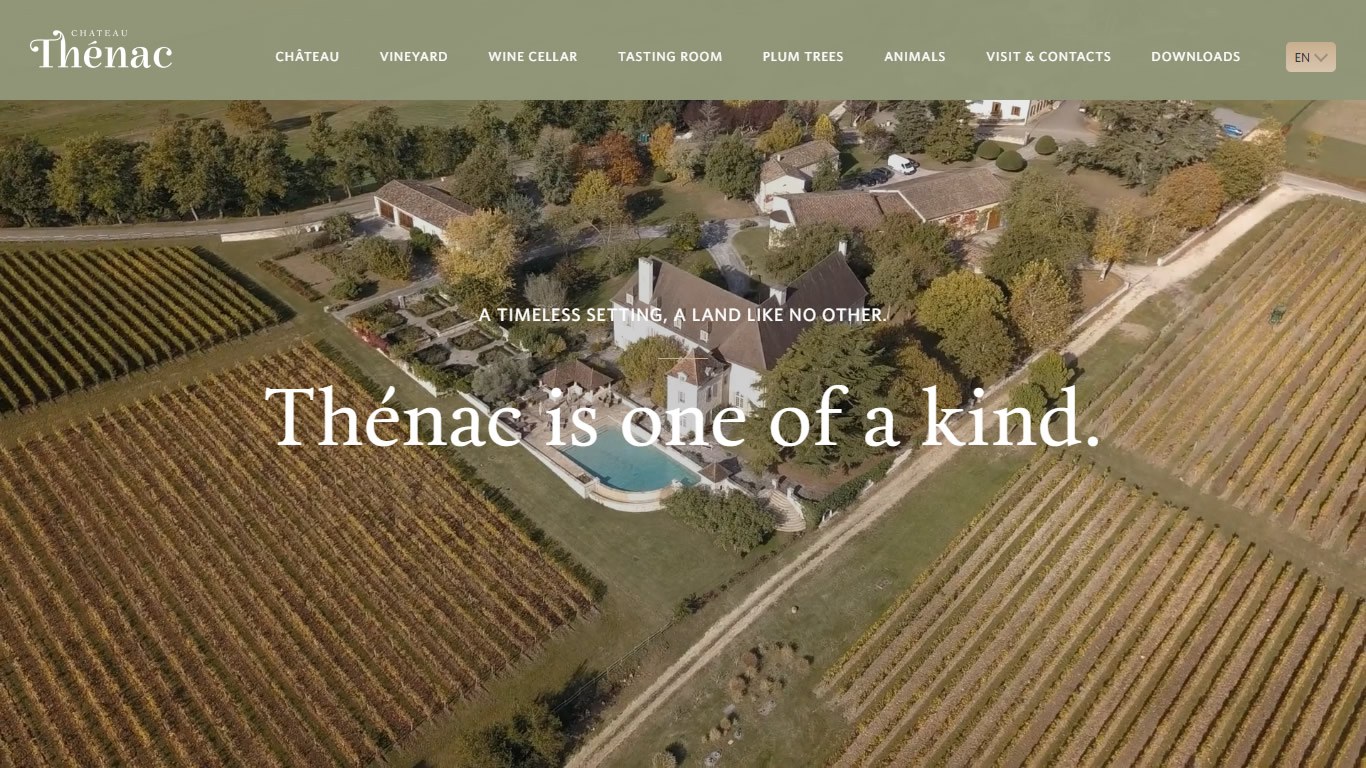
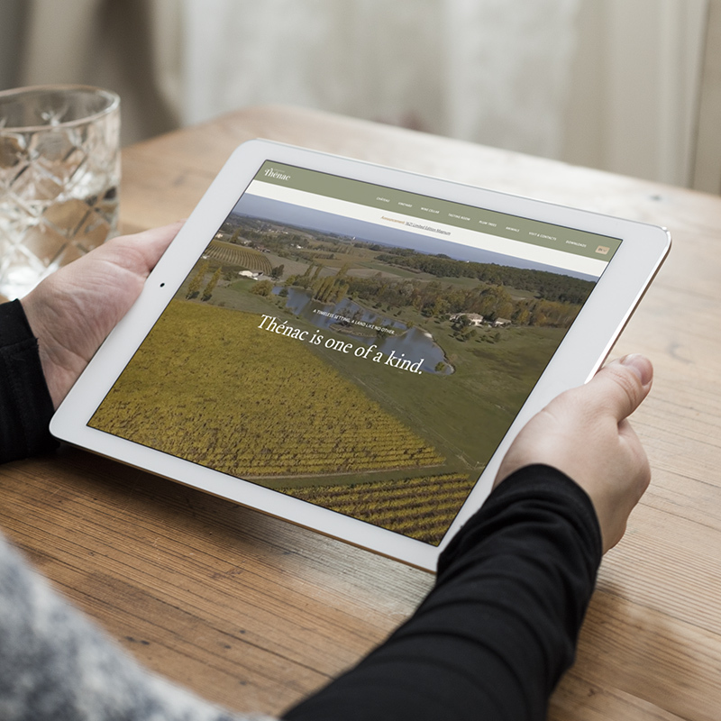
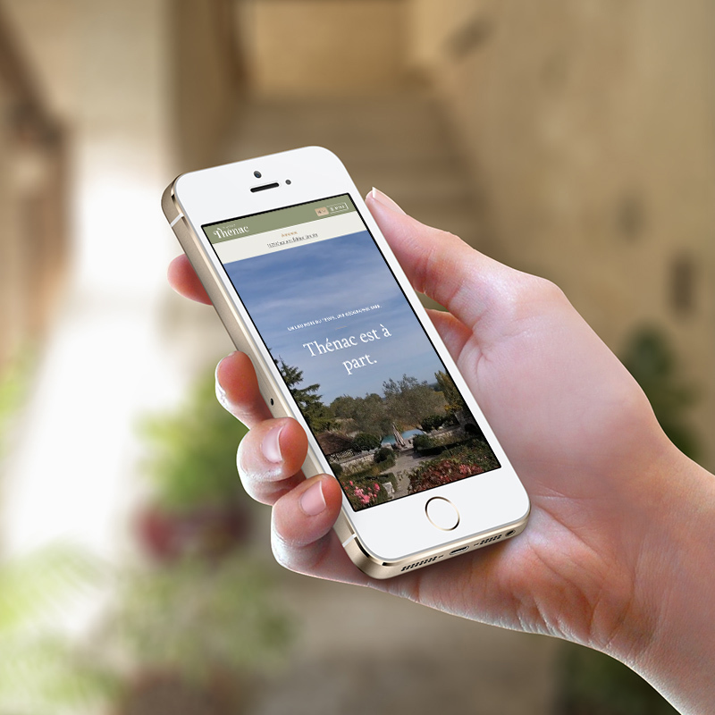
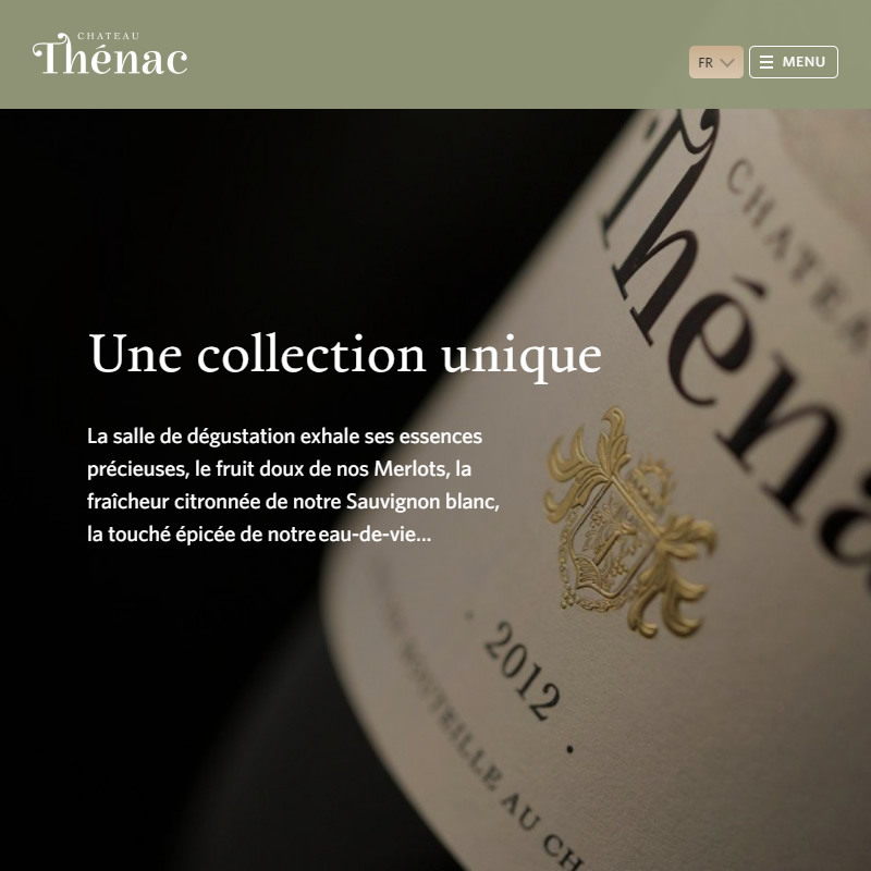
— The home page of the website, as viewed at various resolutions and on different devices.
Château Thenac is a majestic 12th century château in Le Bourg, France.
I was contacted by manager — Oliver Lister — in 2019 to work on the design and build of their new website, from a recommendation by one of my long–standing clients.
Whilst their brand, photography, and overall aesthetic was already in exceptional order, they were struggling to find a web designer and developer to apply it correctly, with an attention to detail and quality that mirrors the château, it’s magical location, and all associated with it.
With my many years experience, design degree background, and hand-coding expertise, I felt the perfect fit to ensure everything could be realised with a perfection I always strive for.
Ingredients.
This might sound a little obvious, but a first and very important step was to ensure that all photos, logos, and other graphical elements were supplied to me in workable and high–resolution formats. When aiming for pixel perfection, the quality of the ingredients is imperative. From that position I could ensure that everything is optimised and fine–tuned — fast loading assets without compromise on how they look.
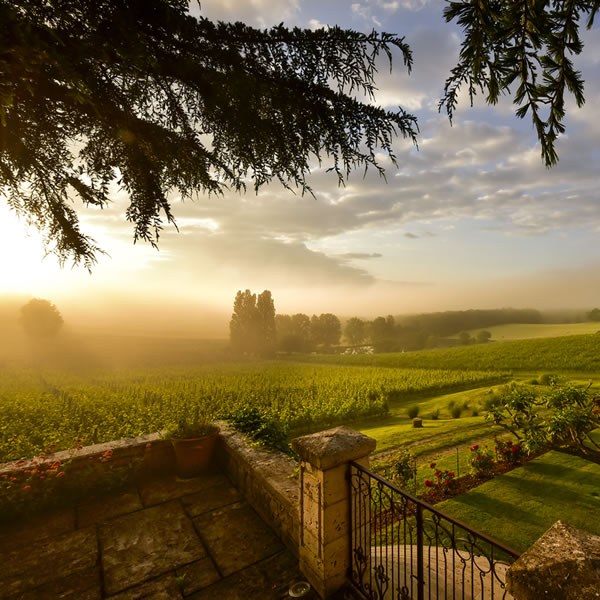
— The logo, and an example of one of the astonishing photos.
Movement.
The client had commissioned a fantastic video of the château and its surrounding area. Unfortunately the previous website used a very poorly edited and optimised version, so I put time and energy in to re–editing and optimising the original video so it displayed at its optimum on the very first page of the website. The viewer could now fall in love with Château Thenac from their very first experience of the site.
— I edited and optimised the original video to ensure it displayed without compromise.
Type.
A core area the client wanted to get right was the typography on the website. With the structure of the site sitting entirely on a minimal foundation of photography and text alone, if one of those facets isn’t quite right, the whole aesthetic can fall to the ground.
I set to the task of researching and testing a number of primary fonts, before whittling down internally to a few that would work. At this stage the objective process was complete, so I supplied them with the options for them to choose from. A primary font was chosen that the client was happy with, and that complimented the brand and feel of the site.
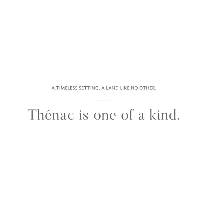
Spacing.
My next step was simply one of ensuring the size, spacing and position of elements was something that had consistency and elegance. When getting this “rhythm” agreed and in place, the rest of the pages and their elements can simply follow these rules and model. With minimal design, this is another example of an area that needs to be perfect to ensure the overall experience has continuity.
— Spacing and layout on the wines page; Some typeface research for primary headings.
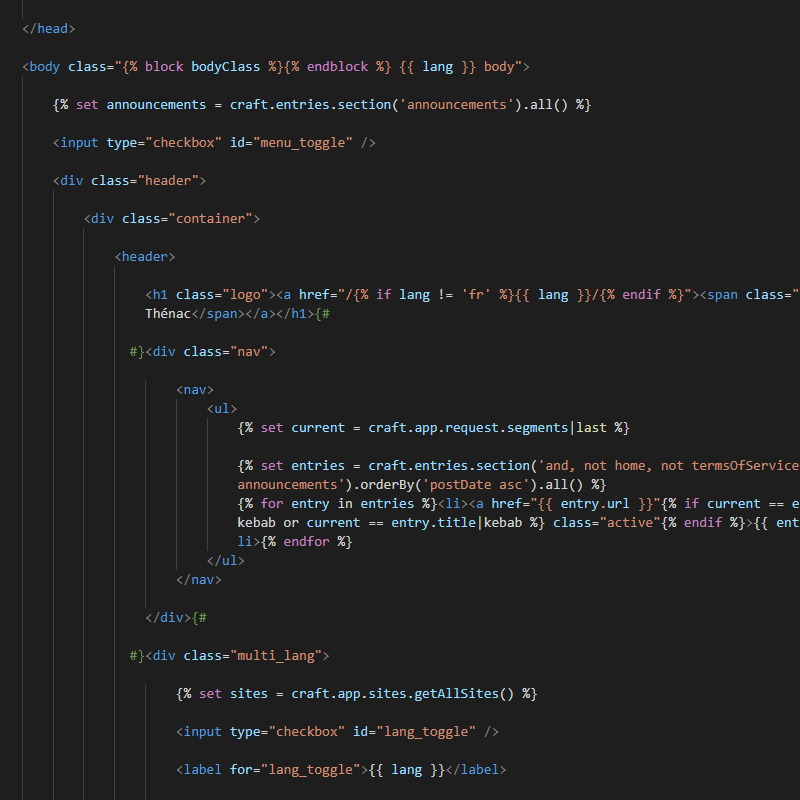
Build.
In many respects the coding and build of this website follows the same pattern as any other, with core non-negotiables always in place, such as:
- ensuring pages adjust thoughtfully and elegantly across all device types and resolutions
- optimising code and elements so that they fast loading, clean, readable, accessible and SEO friendly
Extra attention was needed with the following:
The design relies on many photographs across many pages — and often these photos take up entire screen space. Combining methods of optimising the images to the point where they look great but are fast loading, with technology that only displays images when they are in view, means users experience speed and quality without compromise. The UX was fine–tuned by ensuring smaller images are displayed at lower resolutions.
The site is multi–lingual: French, English and Danish So the coding was written in a way that accommodates the complexities and management that comes with this.
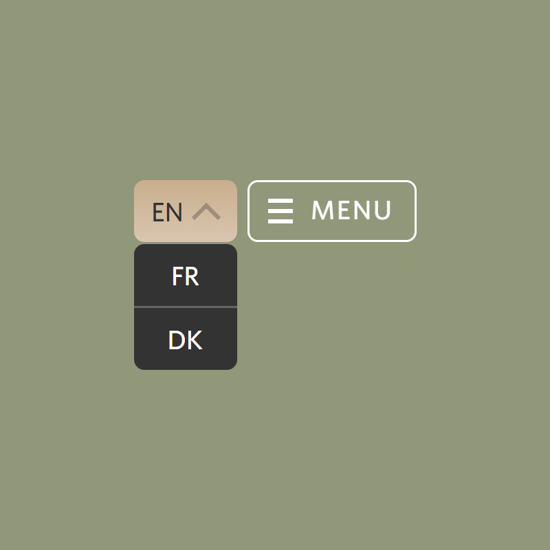
— Clean, accessible, SEO friendly code; Language menu UI
CMS.
The website is built with Craft CMS as its foundation system.
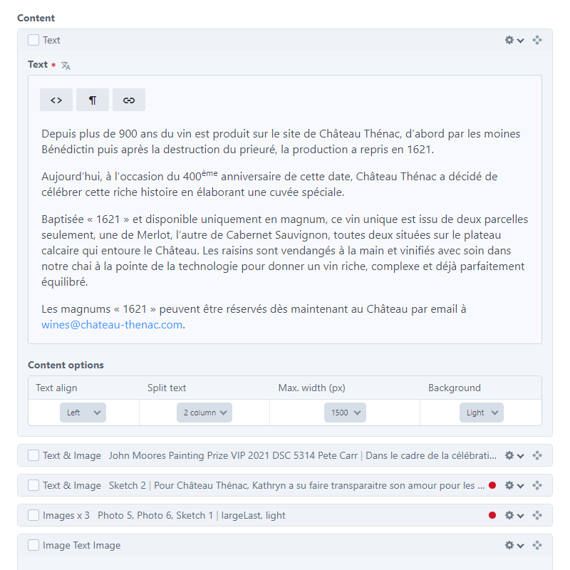
The structure of the editable content has been created in a way that gives the client the required control of content and how it is rendered, while also protecting the integrity of the website’s design and layout.
To address some specific needs and requests of the client, I developed some bespoke content control tools to allow some fine–grained adjustments of content to suit; and also an advanced image cropping tool, so that images can be prepared just right.

— Powered by Craft CMS; Bespoke, content–driven authoring options.
Further development.
The client was really pleased with the end result, and commissioned me further in the development of various E–newsletter designs and coded templates, with many of the above considerations applied once again to this process.
I also continue to develop on the main website — recently having created an announcements module, adding to their content editing tools — and general website maintenance, upgrades and enhancements.
I’m often also brought in to help with content creation and editing — just to give things the designer’s touch!
A joy to work on, and I look forward to my continued relationship with the client.
- Brand and typographical development
- Video and image editing
- Web Design and Development
- CMS set-up and configuration
- E‑newsletter design, development and set-up
Interested in what I can do for you? Contact