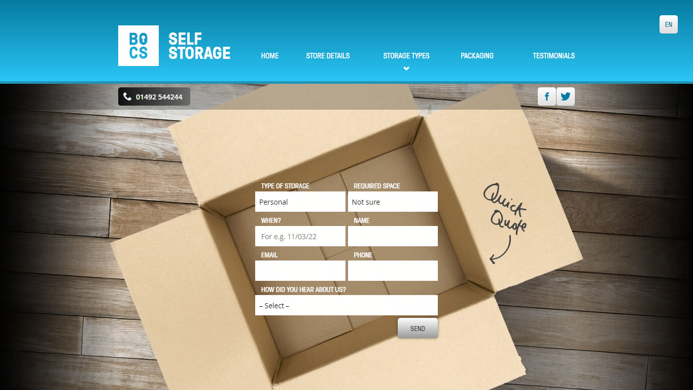
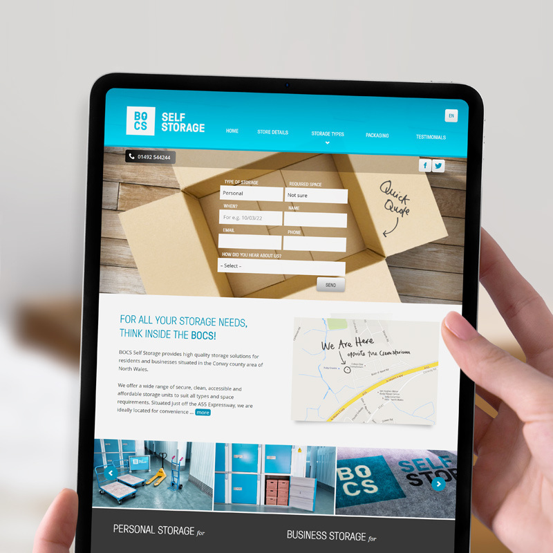
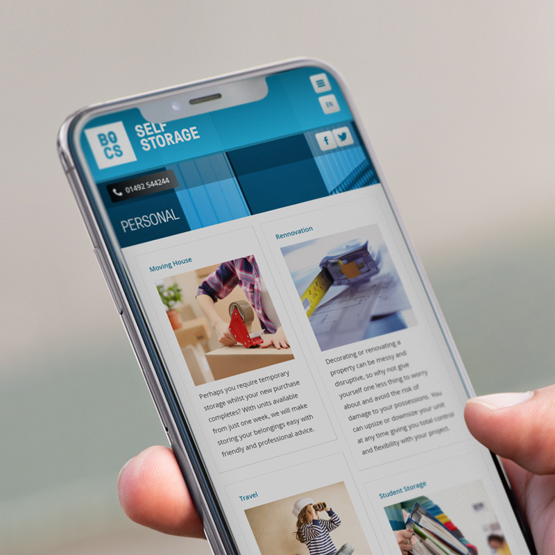
— The website displayed on various devices — desktop, tablet and mobile.
Proud Welshman and seasoned entrepreneur Guto Lewis approached me about his exciting new venture at the very start of its inception.
A man who is thorough in terms of due diligence, he had spoken to a number of agencies and designers in the area, and in the end chose me because of my enthusiasm, attention to detail, and immediate emotional investment in to the project. It’s encouraging to know this was the case.
What’s in a name?
The venture was for a large secure indoor self storage facility in my local area in North Wales, which was to be called “Conwy Self Storage”.
It would have been simple to have cracked–on with the logo design, web design and development tasks, and other work based on this, but I couldn’t help but offer up some creative suggestions for the name for the business. A business name is also intrinsically tied to design considerations — so well worth a discussion at this early stage.
The reason I felt we could be braver with the name, was based on the following:
- There is no reason for the facility not to be a huge success, which could lead to more self storage facilities in other locations in North Wales in the future. This was something that was clear from the business plan. The name “Conwy Self Storage” is immediately limiting in this sense.
- When you put trust in a business to store your belongings, you need a brand that feels established, and exudes that feeling of security, care and cleanliness. Again, could “Conwy Self Storage” as a name feel a little too small-fry to maximise confidence and trust? Even at a mere subconscious level?
- To be candid, the name is also a little boring. Added cleverness with a name can make a business unique and memorable — a marketing ploy all in itself.
The BOCS brand was born.
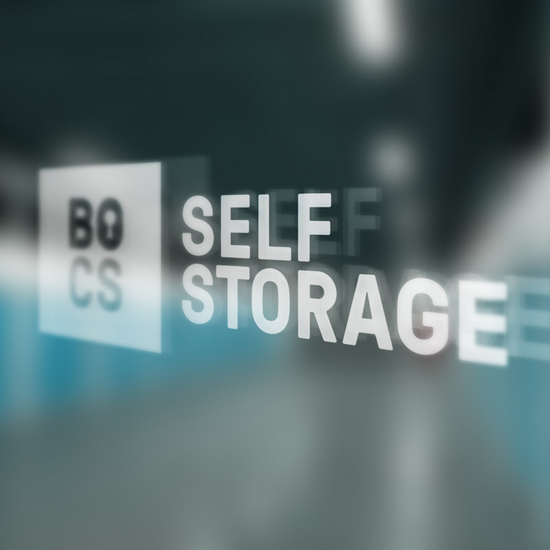
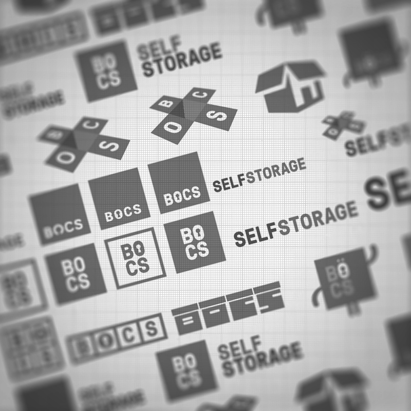
— The final logo in use; A snapshot of initial logo development and ideas.
Why BOCS? As mentioned at the very start of this case study, its founder — Guto — is a proud Welshman, and BOCS has that lovely Welsh slang-like take on the word BOX. Other positives to the name include:
- It is short, and so the logo can be clear, clean, well–spaced, accessible and organised in a much easier fashion than something with more letters, which — let’s face it — sounds very much like how you would want a self storage facility to be. Clever, right?
- What do you store items in? A box. What is a building, essentially? A box. Some nice connotations.
- It sounds more like an established high street brand, rather than a small local business, which is attractive and reassuring to potential customers, and can be used should more facilities open elsewhere.
- I also came up with the strapline: “For all your storage needs, think inside the BOCS”. A play on that well–known saying: “Think outside the box”.
The thoughts behind the logo design are quite simple: I organised the BOCS letters in to a tidy, well–space, organised clean grid — something you would want for how your belongings are stored. Then placed the letters in a solid square, with the letter O having a simple lock icon in the centre — to emphasize the fact that goods are indoor and secure.
The “Self Storage” typeface has a sturdy, dependable feel — and all lettering is uppercase — which communicates a further level of confidence and dependability.
The website.
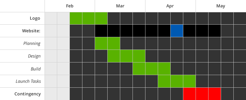
— Project development timeline.
The core goals of the website were also simple and clear:
- To make enquiries and contact methods quick and simple – which was achieved by having a form right at the top of the home page, and clearly available on all other pages. The phone number is also in view on screen at all times, and is animated in a subtle fashion to draw attention.
- To install confidence in the visitor – achieved via the branding, professional photography of the key areas of the facility, and testimonials.
- To inform – clear directions and key information is provided, an illustrated map is prevalent on the website, and there is a handy space guide. It’s important the content was concise and accessible, so users can quickly and easily transition from visit to enquire without confusion.
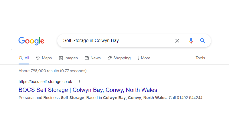
— Page elements animating in; An example of the website’s SEO success.
Of course, as with all website design and development projects I undertake, my non–negotiables are in place:
- Responsive web design – Ensuring pages, across all device types and resolutions, adjust thoughtfully and elegantly.
- Web standards – Code and elements are written in a way that ensures the website is fast loading, clean, readable, accessible and SEO friendly.
With the core goals and fundamentals all in place, the website was soon performing well organically for users searching for “Self Storage in Conwy”, and a variety of other key phrases.
Content Management.
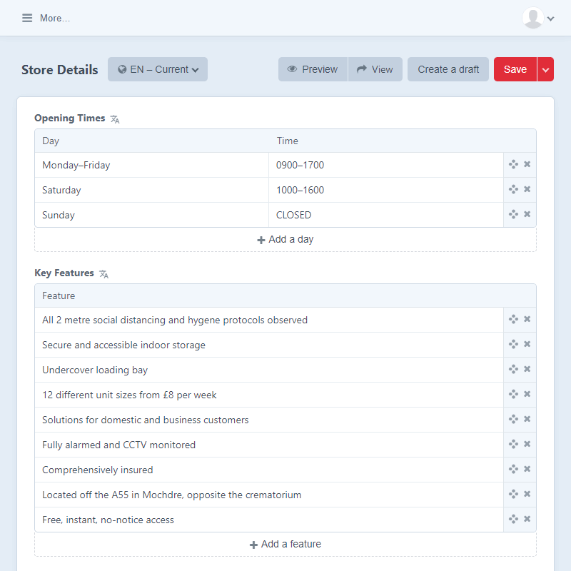
— Powered by Craft CMS; The store details module.
The website has the Craft CMS in place, but not all content is client controlled — and for good reason:
Firstly, there are some titles, descriptions and on–page content which has been optimised by myself so it is SEO–friendly. So to ensure these aren’t changed in a way that could negatively impact the website’s positioning, any amendments are implemented through conversation with me. A well intentioned change of message could drop a websites position due to missing keywords, and that drop could mean less enquiries.
The same goes for changes that could impact negatively on design. E.g. the photo gallery is not available to update via the system. To ensure maximum quality I advise professional photography for updated photos, and then there may be some cropping, positioning and digital treatment required to the photos by me so they have the best impact on the viewer.
The client has full control over content such as store details, testimonials and storage types. All content could be added to the CMS, but not all content should. Sometimes developers are too keen to put everything under client control, when a more thoughtful approach is needed.
And there’s more
I was also contracted to design a number of other deliverables for the project. These include: signage, leaflets, stationery packs, social media assets, and more.
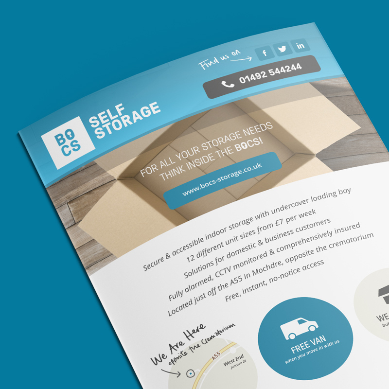
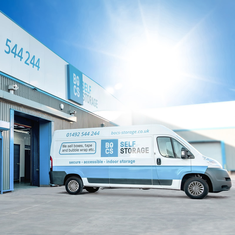
— Leaflet design; Bocsi Bear animation; The logo on the building.
I also created an animated character called “Bocsi Bear”, who is based around the logo form. We haven’t used him anywhere yet, but I’m certainly keen to use him in future in various ways and in various guises. Perhaps a costume could be made that Guto could wear, as he strolls through the corridors greeting customers and spreading cheer!
- Logo and branding design and development
- Web design and development
- CMS and enquiry system set-up and configuration
- Graphic design for print marketing and stationery
- Social media assets, set-up and branding
- SEO Search engine optimisation
- Signage design
Interested in what I can do for you? Contact